
Why mobile-first matters in ecommerce email marketing
Most ecommerce emails are opened on mobile
Over 70% of ecommerce email opens happen on mobile devices. That means your customer’s first impression about your design, message and offer, is happening on a tiny touchscreen while they’re possibly commuting, standing in line, or watching Netflix.
If your email isn’t optimized for mobile viewing, it’s likely getting deleted. People scroll quickly, and your design needs to catch attention and drive action fast.
Practical takeaway: Before designing your next email campaign, assume it’s being viewed on a phone. Build for vertical flow, use big buttons, and shorten your message.
Poor mobile design leads to lost sales
Every pixel matters on a small screen. If your emails are hard to read, slow to load, or awkward to navigate, you’re creating friction that pushes users away.
Common issues include:
- Text that’s too small to read
- Buttons that are hard to click
- Images that load slowly or break
- Layouts that require side-scrolling
Each of these friction points increases bounce rates, unsubscribes, and lost conversions.
Action tip: Use a mobile-first preview tool to check emails before sending. If a button feels hard to tap with your thumb, your customer won’t bother either.
What makes mobile email design different from desktop
Screen size and interaction zones
Phones are designed for vertical scrolling. People use their thumbs to navigate, which means:
- Avoid side-by-side content blocks
- Keep key CTAs in the middle-bottom of the screen
- Prioritize single-column layouts for clean reading
Email Marketing Tip in action: Place your main CTA at least 75% down the email to hit the thumb zone and encourage scroll-through.
Load time and data sensitivity
Not all mobile users are on Wi-Fi. Heavy emails filled with uncompressed images or embedded video can slow down or fail to load altogether.
Best practice: Compress images and keep file sizes lean. Under 200KB is ideal.
Top 9 mobile-first email design tips for ecommerce brands
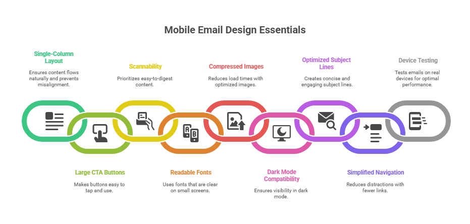
1. Use a single-column layout
- Makes content flow naturally
- Prevents squished or misaligned blocks
- Improves focus on each element
Why it works: Vertical scroll is native to mobile, so stacked elements reduce overwhelm and friction.
2. Make CTA buttons large and easy to tap
- Minimum size: 44x44px
- Button text: at least 16px
- Use clear, benefit-driven copy: “Claim your discount,” “Shop the drop”
Real-world tip: Test your CTA by tapping it with your thumb. If it’s hard for you, it’s hard for everyone.
3. Prioritize scannability
- Use bold headings and short paragraphs
- Break up content with subheads and bullet points
- Keep each block under 3 lines
Why this matters: Most users scan emails in under 8 seconds. Make content easy to digest.
4. Use fonts that are readable on small screens
- Body text: 16px minimum
- Headings: 22–26px
- Avoid thin or fancy fonts
Font suggestion: Use system-safe fonts like Arial or Helvetica for guaranteed legibility across devices.
5. Compress images for faster load times
- Use WebP or optimized JPEG formats (We are using TinyPNG)
- Keep individual images below 200KB
- Don’t rely on image-only designs
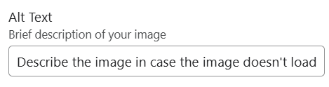
Extra value tip: Always include ALT text for each image. Both for accessibility and in case images don’t load.
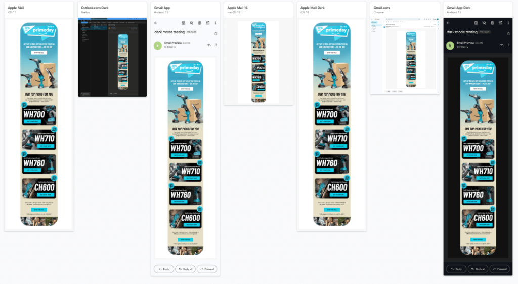
6. Make your emails dark mode friendly
- Many iOS and Android users have dark mode enabled by default
- Ensure your logos, buttons, and background colors remain visible
- Avoid transparent PNGs that may disappear on dark backgrounds
Quick test: Send a test email and view it in dark mode on your own device. Alternatively you can use Litmus or the native Klaviyo “Inbox testing” feature
7. Write mobile-optimized subject lines and preheaders
- Subject lines: 35–40 characters max
- Preheaders: 40–70 characters
- Treat this like your email’s “above-the-fold” headline
Copy tip: Include your main hook or offer in the first 3–5 words.
8. Simplify or eliminate navigation menus
- Mobile users rarely use full nav bars
- Use 2–3 simple links max: “Shop Men | Shop Women | New Arrivals”
- Let your CTA carry the focus
Strategic angle: Less choice = more clicks. Fewer distractions drive better results.
9. Test emails on real devices
- Tools like Litmus, Email on Acid, or manual testing on iOS and Android
- Always send a test to your own inbox and scroll with your thumb
What to look for: Button placement, font size, broken layouts, and slow load times.
Best tools for designing mobile-friendly emails
| Tool | Key Features |
|---|---|
| Klaviyo | Responsive templates and mobile previews |
| Stripo | Mobile-first design blocks and templates |
| BeeFree | Drag-drop builder with mobile modes |
| Litmus | Device testing and dark mode visualization |
| Figma | Ideal for mockups before uploading to your ESP |
Pro tip: Use Figma to collaborate with designers, then import into your ESP to finalize for responsiveness.
Mobile email design FAQs for ecommerce brands
What’s the best width for mobile emails?
600px is standard, but most email platforms automatically adapt for smaller screens.
Can I include gifs and video?
Yes, but compress GIFs and link to hosted video using a clickable thumbnail.
How long should a mobile email be?
Aim for 1–2 screen scrolls. Short, punchy, and value-first works best.
Do buttons work differently on mobile?
They work the same, but must be larger and spaced out to avoid tap errors.
When should I send mobile-optimized emails?
Mid-morning and evening tend to perform well, but A/B test for your audience.
Mobile-first means more revenue
Designing emails for mobile-first isn’t a trend. it’s the new baseline. When your emails are optimized for thumb scrolling, fast loading, and short attention spans, you meet customers where they are.
The result? Higher engagement, fewer bounces, more conversions.
At The Mail Effect, we design ecommerce email flows that look amazing on mobile—and convert just as well. If you’re ready to modernize your email strategy, let’s talk.