Why email design and structure matter in ecommerce
Email isn’t just another communication channel for ecommerce brands. It’s one of the most powerful and profitable. Think of each email as a miniature sales page. It’s your direct link to a potential buyer’s attention, and how you structure that message determines whether it ends up in the cart… or the trash.
A clear, strategic design improves how readers process information, builds trust, and motivates action. Without structure, even your best offers may go unseen or ignored.
Your email is a mini sales page
Every ecommerce email should be treated like a digital storefront window. It has one job: to capture attention and convert interest into action.
Well-structured emails help:
- Highlight value fast
- Solve customer pain points
- Build emotional or practical urgency
- Inspire clicks that drive sales
Email Marketing Tip: Before writing any email, define its primary goal. Do you want to introduce a product, recover a cart, or deliver a discount? Center your structure around that.
Structure = engagement = conversions
Successful ecommerce emails follow a proven formula. Why? Because readers need clarity and motivation to act. Structure helps guide their eyes and decision-making.
Well-formatted emails:
- Get higher open and click rates
- Build brand recognition
- Convert browsers into buyers
Strategy Insight: The human brain processes visual cues and logical flows faster than dense text. Structure helps deliver a “yes” moment before readers even realize they’re buying.
The 8 essential parts of a high-converting email
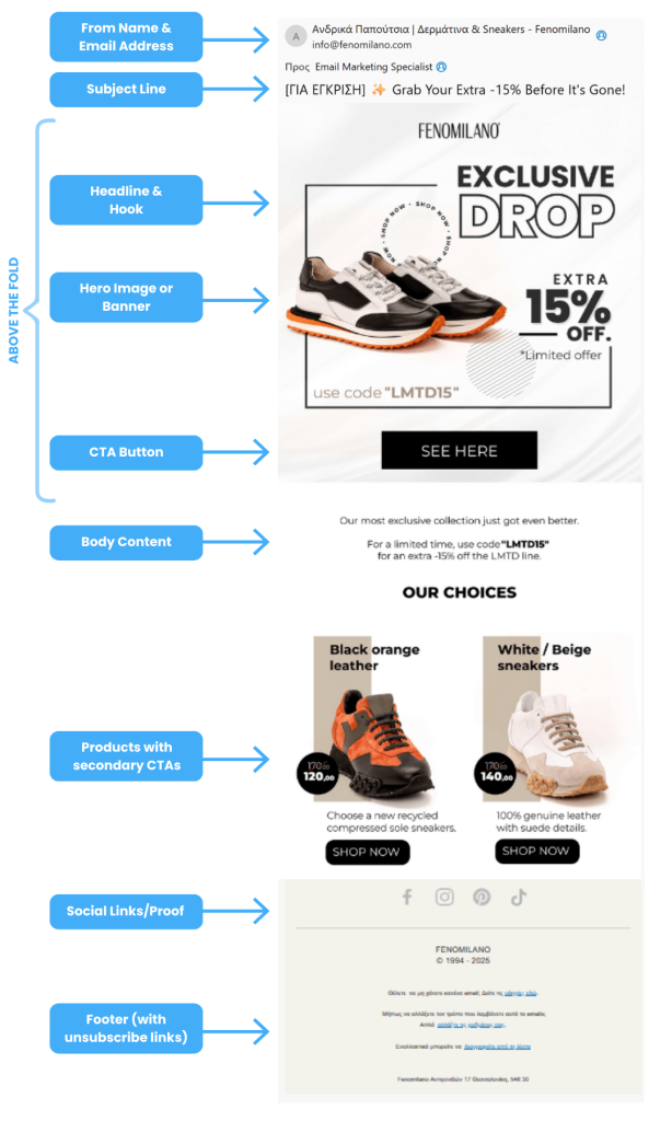
Let’s break down each piece of a high-performing ecommerce email, with practical actions and why they work.
1. From name and email address
Why it matters: Almost half of recipients decide to open an email based on who it’s from. If they don’t recognize or trust the sender, they won’t bother.
Email Marketing Tip:
Use a real person’s name (e.g., “Sophie from GlowSkincare”) paired with a branded but friendly email likehello@yourbrand.com.
Why this works: It humanizes your brand and adds familiarity, increasing trust and open rates.
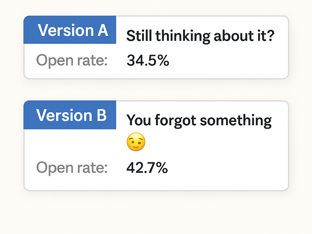
2. Subject line
Purpose: The subject line is the gatekeeper to your email. You have 6–9 words to earn a click.
Email Marketing Tip:
Spark curiosity, relevance, or urgency. Use language that feels personal and conversational.
Examples:
- “Still thinking about it?”
- “Your essentials just landed 💼”
- “You’ve unlocked something special”
Why this works: These trigger emotions or questions, which increases the likelihood of engagement.
3. Preheader text
Purpose: This is your second shot at the click—used to reinforce or expand on the subject line.
Email Marketing Tip:
Think of it as your subtitle. Use it to complete the message started in the subject.
Example:
- Subject: “Final hours to save”
- Preheader: “Your 20% discount disappears at midnight ⏳”
Why this works: It adds urgency, teases content, and improves inbox appeal.
4. Hero image or banner
Purpose: Visuals grab attention before a single word is read. This is your chance to show the product in action or evoke an emotion.
Email Marketing Tip:
- Use lifestyle imagery showing product use
- Optimize for mobile-first design
- Avoid all-image emails (include text too)
- Use descriptive alt text
Why this works: People process images faster than text. Compelling images boost clicks and product recall.
5. Headline and hook
Purpose: Introduce the key benefit or emotional hook of your offer. It’s the first line people actually read.
Actionable tip:
- Lead with a bold benefit or question
- Keep it short and impactful
- Make it scannable
Examples:
- “Say goodbye to rough skin”
- “Trusted by 15,000 coffee lovers”
Why this works: Readers often skim. A strong hook ensures they stop and scroll.
6. Body content with value props
Purpose: Now that you’ve hooked them, it’s time to connect your product to their problem.
Actionable tip:
Use this structure:
- Problem → Product as solution
- Feature → Benefit
- Social proof → CTA
Pro tip:
Use short sentences, bullet points, and clear visuals. Always write like you’re talking to a single reader.
Why this works: This structure taps into pain points, presents a solution, and builds trust through proof.
7. CTA button
Purpose: This is the moment of truth. What do you want the reader to do?
Actionable tip:
- Use bold, contrasting buttons
- Make the CTA button action-oriented
- Place one primary CTA above the fold, and repeat it below
Examples:
- “Shop now”
- “Grab 15% off”
- “Start your trial”
Why this works: Clear, repeated CTAs reduce friction and guide users toward the intended action without distraction.
8. Footer with links and compliance
Purpose: While often overlooked, the footer plays a critical role in compliance, credibility, and customer service.
Actionable tip:
- Include your unsubscribe link
- Add contact info and social links
- Link to returns or FAQs
Why this works: A polished, legal, and informative footer protects your sender reputation and encourages trust.
Bonus additions to boost performance:
Product grid with secondary CTAs
If your email supports multiple items (like a product drop, collection launch, or post-purchase email), include a 2–4 product grid with:
- Thumbnail images
- Product name + short benefit (e.g., “Breathable cotton. Best seller.”)
- Price
- Secondary CTA: “Shop Now” / “View Item” under each product
This structure allows scanning and shopping without scrolling endlessly.
Social proof block
Show how others are using and loving your product:
- Star ratings + review quote: “Best leggings ever—so soft and flattering!”
- User-generated content (UGC) or images from Instagram with @mentions
- A testimonial slider or 2–3 customer quotes
Why it matters: Customers trust other customers more than your copy. Social proof reduces hesitation and reinforces decision-making.
Advanced tips for improving every section
Writing subject lines that get opened
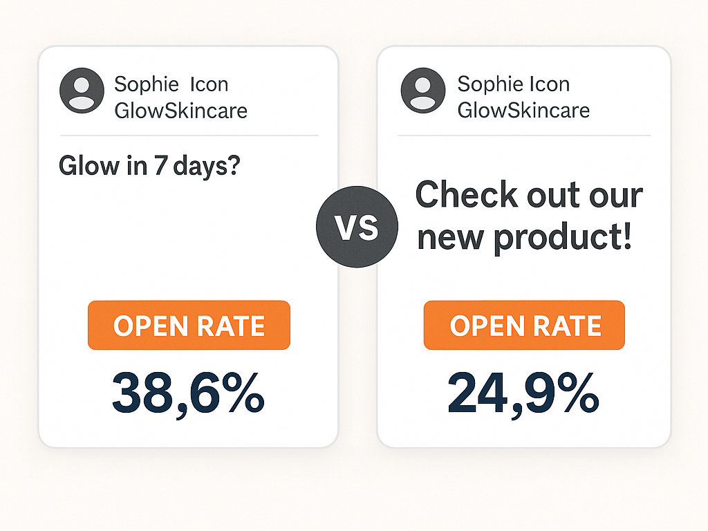
Strategies:
- Create urgency: “Only hours left”
- Personalize: “Jamie, your skincare just shipped”
- Tease a benefit: “Glow in 7 days?”
Tip: Test 2–3 variations in your next campaign and track open rates.
Designing buttons that get clicked
Strategies:
- Limit to one main CTA per email
- Contrast colors to make it stand out
- Repeat CTA near the top and bottom
Tip: Test button placement and copy length to see what converts best for your audience.
Using copywriting frameworks
Frameworks simplify writing while enhancing clarity. Try these:
- AIDA: Attention, Interest, Desire, Action
- PAS: Problem, Agitate, Solution
- FAB: Feature, Advantage, Benefit
Tip: Use these models to structure your copy when you’re stuck or writing quickly.
Visual email examples that convert
Here’s a cheat sheet of effective layout ideas for different email types:
| Email Type | What Works |
|---|---|
| Welcome Email | Big hero image, short brand intro, CTA with a discount |
| Cart Abandonment | Thumbnail of items, reminder of benefits, “Return to cart” CTA |
| Product Launch | Bold headline, lifestyle shot, clear “Shop now” button |
| Post-Purchase | Thank-you note, product tips, and suggestions for related products |
Email Marketing Tip: Save templates for each of these and customize them per campaign.
FAQs: Ecommerce email design and structure
How long should an ecommerce email be?
Aim for under 400 words. Focus on one clear message per email.
Can I use multiple CTAs?
Yes, as long as they all support the same goal. Avoid offering multiple destinations or actions.
What’s the best time to send these emails?
Try Tuesday or Wednesday mornings, and Sunday evenings. Always A/B test to find your sweet spot.
What if I don’t have professional images?
Use mockups, GIFs, or user-generated content (UGC). Real and authentic wins over polished.
How do I A/B test email design?
Start small: test your subject line, CTA placement, or hero image. Measure open and click-through rates.
Every element should earn its spot
The beauty of email marketing lies in its structure. Each section should have a strategic purpose, working together to push the reader one step closer to clicking that CTA.
At The Mail Effect, we help ecommerce brands structure emails that not only look good but perform even better. With the right email strategy, your next campaign can become your best-converting asset.